I recently decided to quit jumping from responsive grid to responsive grid in hopes of finding the perfect grid that solved all my problems and filled the void left by a number of other grids used in the past.
I made this decision, because for the most part the previous grids I tried all did the same thing, although they may have each implemented the features slightly different. Basically you had the option to define the column and gutter width, set which regions of the layout would span a specified number of columns and where those regions would start on the grid. Some grids also had nice calculations or mixins to push and pull the sidebars so the presentation did not have to match the source order, and of course you could manipulate the number of columns based on breakpoints. I thought all of this was awesome—and it is awesome—so I curbed my idea of discovering a magic grid that is easier to manage, more intuitive, or perhaps offer greater control, and decided to use Susy for at least three consecutive projects. Then something happened.
I went to DrupalCon and attended a session titled Managing Responsive Web Design with Sass and Breakpoint. That sounded good to me. I like RWD, I like Sass, and I like breakpoint, so I figured I’d go see what the latest combination of these tools looked like. Not long into the session the presenters, Sam Richard and Mason Wendell, were showing this amazing asymmetric grid called Singularity. My mind briefly jumped back and forth between my resolution to hold tight with one grid and my gut instinct to jump into this grid—head first, arms flailing—as soon as possible. Needless to say (but I will anyways) I opted to give the new grid a try.
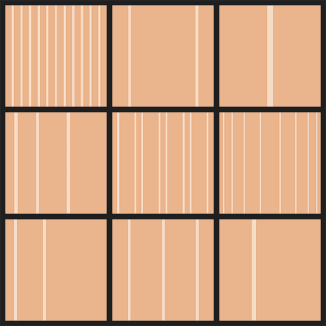
What makes it new? It’s asymmetric. What does that mean exactly? It means every column does not have to be 4em wide with 1em gutters. It means there does not have to be 12, 16, or 24 columns. It means the left sidebar does not have to be either two or three columns. It means it’s not really even a grid, at least not the way I’m used to thinking about them. For example you could have a two-column desktop layout where the first column is exactly 282 pixels, the right column is 658 pixels, and the gutter is 20 pixels, or you could create a four column layout where the left and right sidebars are 180 pixels wide, and then you have two columns in the middle that are both 370 pixels wide. The column widths do not have to be based on pixels, you can use ems, percents, or unit less numbers. The image below shows a variety of arbitrary column combinations (as well as some strange optical illusions if you stare too long).
My intention is not to exhaustively list and describe all the Singularity features, the Singularity github page does a much better of that than I could. Instead I want to point out that it is useful tool for fitting asymmetric layouts into a grid structure, and if you are looking for such tool—check it out. At this point I’ve only experimented with Singualrity. I still have yet to use it on a project, so in my mind it is still a shiny new toy that becons to be played with. I’m sure there are some other grids doing something similar and probably a number of new grids to follow that will offer an assortment of comparable features. But, for now it’s good to know I have a go to grid when I want to get off the grid.