7 Website Design Best Practice tips for 2022
No business denies the importance of website design, but very few know and follow website design best practice.
Science and research have proven that visual appearance has a huge impact on user engagement on a website. You must have read the statistics on website design and that you have less than a second to make a first impression.
Your website design is the first thing that visitors experience, and it takes them just around 50 milliseconds to decide whether they want to stay or bounce off to another site so the stakes are high.
How do you create a website that keeps visitors hooked and grabs their attention?
This is where following best practice for website design comes into play.
7 Website Design Best Practices to Follow
You don’t have to reinvent the wheel. Stick with what works.
How the human brain processes visuals and behavioral psychology principles haven’t changed, so you just need to follow proven web design practices and techniques. And what exactly are those?
Here is a list of 7 of the best website design practices that are sure to boost conversion rate, engagement, session duration, and revenue:
- Clean color scheme
- Use of white space
- Effective typography
- Simple navigation
- Prominent CTAs
- Reduce friction
- Mobile responsiveness
1. Color Scheme
If there has to be one website design best practice, it should be understanding color psychology.
A lot of businesses take colors for granted during the website design process. Colors, however, have a significant impact on user behavior and brand identity. Color scheme is a key visual element of the design process, you can’t ignore it.
Here is what research and science say:
- People make a subconscious judgment about products, people, and the environment within the first 90 seconds of interaction and between 62-90% of it is based entirely on color. (Institute for Color Research)
- Colored ads are read up to 42% more often than ads printed in black and white. (Color for impact)
- Over 92% of people say that they give most importance to visual elements when buying a product and 84.7% of people said that color accounts for more than half among other factors for product purchase decisions. (Colorcom)
- Color improves readership by 40%, learning by 78%, and comprehension by 73%. (Colorcom)
- Color increases brand recognition by 80%. (University of Loyola, Maryland)
- Black and white image grabs attention for less than a second while colored image grabs attention for up to 2 or more seconds. (Colorcom).
You need to do two things when deciding on a color scheme for your website:
- Choose colors carefully. Every color has a different meaning attached to it. For example, red is known for increasing appetite, black relates to boldness, security, and authority, blue represents calmness, trust, and strength, and so on
- Keep the color scheme consistent to improve brand identity. This helps your target audience relate those colors to your brand.
Take Pepsi, for instance. The chances are you thought of their logo or branding colors the minute you read that brand name. Now look at their website:
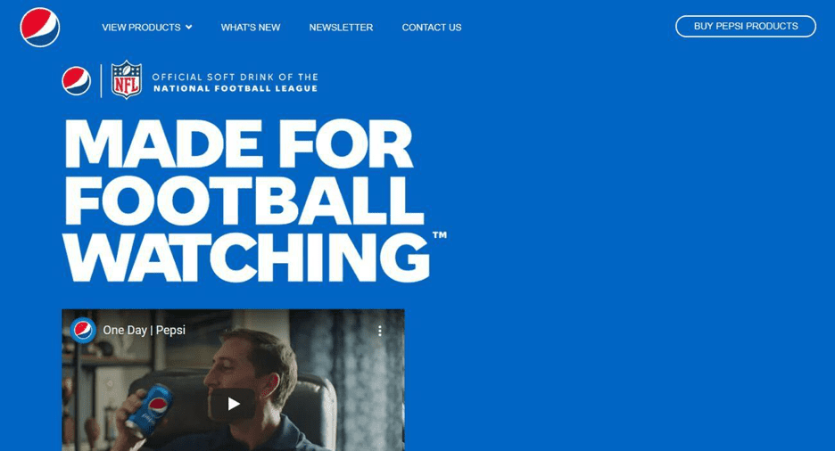
Pepsi has always chosen blue from its logo to aluminum drink cans and bottle tags and caps. A blue website is consistent with its branding strategy. Customers already associate blue with Pepsi, and they’ve capitalized on that through their website.
Stop ignoring colors, they impact your business website and potential customers more than anything else.
2. White Space
It is the negative area and the space between elements on your web page. Any empty space between any two elements is known as white space or negative space. It is used to give visual breaks to the users, improve interaction, highlight prominent elements on a web page, and much more.
White space is the fundamental building block of web design. Here is an example of what negative space can do to your website design:
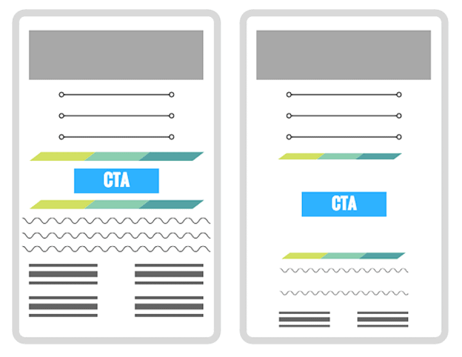
The website design with more white space is easy to read and makes CTA prominent. Research shows that white space increases comprehension by 20%. It also improves focus and attention. Elements that are surrounded by white space grab user attention and they can focus on the element easily.
Follow these web design best practices for using white space:
- Add white space to keep the website design user-friendly and easy to navigate
- Highlight elements using white space to make them prominent
- Use white space to create visual hierarchy
- Use white space to guide visitors to the most crucial parts of the web page such as a form or CTA
- Use both micro and macro white space to create balance.
3. Typography
Typography is another important web design element that impacts readability, credibility, UX, conversions, and revenue.
A study found that 46% of consumers use visual elements including typography and font size to judge the credibility of a website and business. So, it isn’t what you write, but how you write and present it is also important.
You have been told that “content is the king” and it is true. But what’s more important than content is how the content is formatted and presented to the website visitors. The initial impression is design-related, so it should catch the attention of your target audience first, and then they will read what you have written.
The best copy, if not designed well, will fail.
Here is an example of how typography improves readability and the overall design and feel of your website:
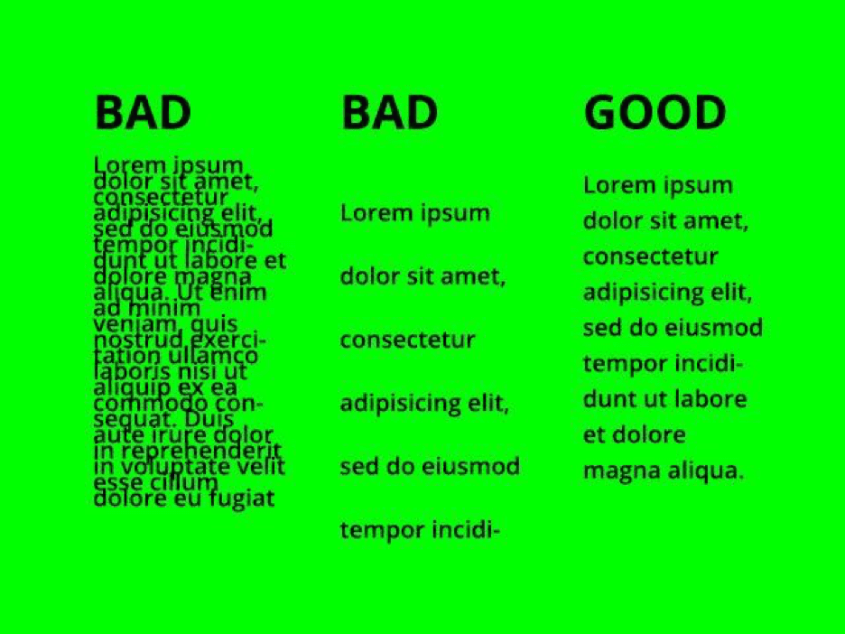
Typography includes font style, appearance, and structure. This covers everything ranging from font style to its color to white space to visual hierarchy and more.
You need to focus on two things when using typography in the context of web design:
- It should be clear, readable, and visually appealing
- It must be consistent with your brand strategy and style guide.
Here are the website design best practices for typography:
- Focus on readability when choosing a font style. Standard fonts work best
- Be consistent and avoid using multiple typefaces
- Write text that’s easy to skim
- Write short sentences, short paragraphs, use bullets, subheadings, and hierarchy
- Add ample white space between text blocks
- Use color contrast to improve readability.
4. Navigation
Often overlooked, navigation is a key website design component that helps visitors and search engines find what they are looking for. If visitors can’t navigate to the right place on your website, what’s the purpose?
The best way to accomplish an easily navigated website is to ask yourself what you would do if you were in your visitors’ place. And visitors expect nothing but simplicity.
A study by Google found that people tend to find simple websites more appealing than complex ones. Sticking to a standard format and menu allows people to know exactly where to go. Adding a search bar in the menu is a great way to help visitors find what they are looking for.
Here is an example of how to keep navigation and website structure simple and understandable:
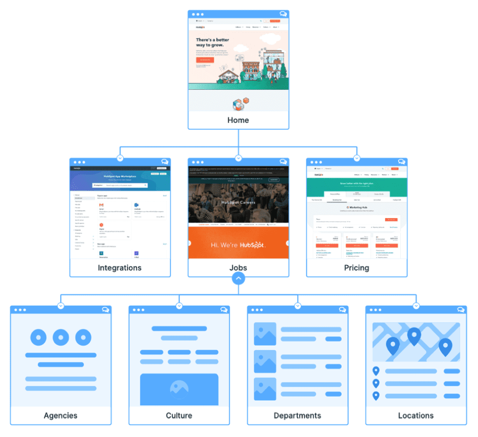
Navigation isn’t just about the site’s structure, it includes menus, footers, headers, widgets, search bar, and everything that helps visitors move from one point to another on your website. This is a reason why 94% of people say that website navigation is the most important feature of any business.
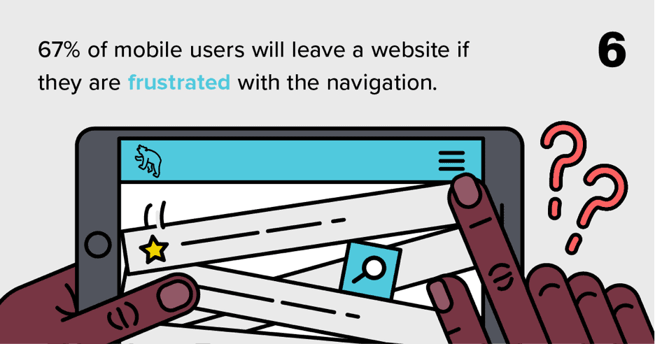
Navigation design is more important for mobile visitors. A survey found that 67% of mobile users will leave a website if its navigation is frustrating:
How to design perfect navigation for your website? Here are the best practices to follow:
- Make the navigation bar prominent and use it in both the header and footer
- Keep its structure simple
- Don’t ignore search engine optimization as navigation should be understandable to search engine crawlers too
- Make navigation descriptive so visitors know where they will land when they click a link
- Keep navigation consistent throughout the website
- Make hyperlinks different and prominent so they are recognizable
- Add a search bar to help visitors find what they are looking for with a simple search
- Use breadcrumbs throughout your website to help visitors know where they are and how to switch between related web pages
- Keep the navigation options to a minimum. Don’t try to link to every web page from the navigation. Link to key areas on your website.
5. Reduce Friction
Hick’s Law states that users take a longer time to make decisions when faced with several complex choices. Minimizing choices will improve decision-making time.
This law plays a key role in web design.
Friction reduction refers to reducing distractions and removing both visual and design elements that distract visitors from conversion. The human brain has limited power to process information and friction increases their cognitive load.
Suppose your website consists of a lot of options. In that case, you can highlight the ones you recommend to users on your website and utilize progressive onboarding that minimizes your visitors’ cognitive load. If the tasks are complex, you can break them down into smaller steps.
Instead of spoiling your website visitor for choice and overwhelming them, offer appropriate options that make the choice easy. An example of eliminating unnecessary options could be using the brand’s logo in lieu of a “Home” button to link back to your website’s homepage.
Examples of friction on your website include:
- Inconsistencies
- Unnecessary images or photos
- Multiple CTAs
- Ambiguous structure.
Here are the website design best practices for reducing friction:
- Remove unwanted shapes, images, designs, and patterns
- Use visual cues and white space to guide target audience to key elements on your website
- Stick with one CTA per web page
- Keep design consistent to reduce cognitive load
- Use contrasting colors to highlight key areas
- Understand the user journey and create web design accordingly to drive visitors to the right place
- Reduce the number of steps to complete an action
- Minimize the number of clicks it takes to convert
- Avoid using surprise design elements that people aren’t familiar with.
6. Call to Action
Call to action (CTA) drives conversion and sales. The CTAs you use on the landing pages and throughout the website are an important part of website design since these are embedded in the design.
Where to add CTAs, what color scheme and contrast to use, what typography to use, and how to design it are some of the key aspects of CTA designing.
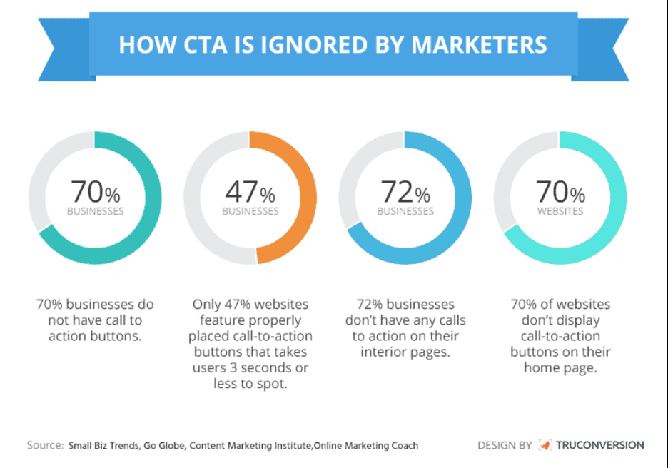
Sadly, 70% of businesses don’t use the call to action buttons and 72% of businesses don’t have CTAs on internal pages:
You don’t just have to add CTAs on all the pages throughout your website, but these must be well-designed, so visitors don’t ignore them. Ideally, the CTA should be the most prominent element on any given web page and visitors must be able to see it in less than a second.
How to design CTAs that stand out from the crowd and generate clicks and conversions? Here are the web design best practices for the call to action that you must follow religiously:
- Make CTAs personalized as customized CTAs perform 202% better than generic ones
- The conversion rate of a personalized CTA is 25-45% higher than its counterparts
- Prefer CTA buttons over CTA text as buttons are prominent and perform better in terms of clicks and conversions than text CTAs
- Make the call to action prominent. It should be instantly visible to the visitors
- Use descriptive text for CTAs that clearly tells people what to expect
- Add action words in the CTA and use the first person as people can imagine themselves doing the same task
- Using the word “click” or “tap” significantly increases clicks to CTA buttons
- Add white space around the CTA buttons
- Add CTA above the fold so that visitors who don’t scroll (most of them don’t) can still find CTA and might end up clicking it
- CTAs should be relevant and consistent with the copy and webpage design
- Contrasting CTA buttons outperform as they are easier to spot and grab attention.
7. Responsiveness
Most visitors to your website use a mobile phone to access it. If you haven’t optimized your website for mobile devices, it won’t benefit you the way you want. Internet users spend over half their time online browsing through websites on their mobile phones.
Over 87% of smartphone users utilize their devices to perform at least one internet search a day. More than 64% of all searches are carried out using mobile phones. It’s no wonder that Google favors mobile-friendly websites on their results pages — 70% of results that come up on the first page are websites that are optimized for mobile phones.
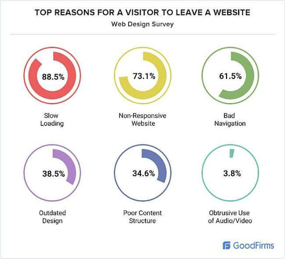
The best way to rank high in the search engines is to optimize your website for mobile devices extensively. If your website isn’t mobile-friendly, chances are visitors won’t spend too much time on it. A whopping 73.1% of people will leave your website if it isn’t responsive:
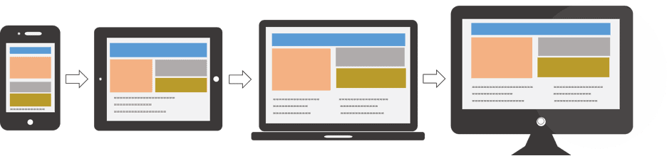
Responsive design doesn’t mean your website should work seamlessly on all devices, but it is referred to as a mobile-first web design approach. You need to design your site for mobile first (as most people access your site from a mobile device) and then decide what’s visually and functionally necessary:
Follow these mobile-first web design best practices to make your website responsive, visually pleasing, and functional by eliminating unnecessary elements:
- Use responsive website themes if you are using a theme or template
- Test your website for different devices using this free tool and tweak the design to fix issues
- Use flexible and adaptive layouts and elements
- Focus on a mobile-first approach and design your site for mobile and then translate that into other devices
- Resize and reformat images with minification of CSS and JavaScript
- Keep the layout of the site fluid as it will transform and reshape automatically on different devices
- Prioritize content for mobile site and decide what to show and what to hide. This helps with search engine optimization too
- Eliminate friction (see above).
Best Website Design 2022 Examples
We have handpicked the best web design examples for inspiration and ideas across categories with a breakdown of what each site has done exceptionally well in terms of website design.
Let’s get some inspiration:
1. Best Homepage Website Design: Basecamp
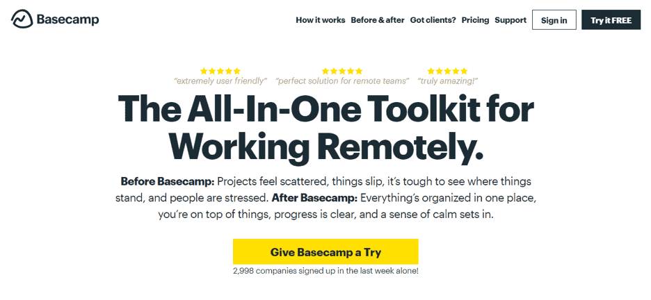
What we love:
- A simple and clean design above the fold with no fancy color scheme
- Contrasting CTA that grabs your attention right away as soon as you land
- No friction. The purpose of the homepage is to persuade visitors to sign up for the free trial.
2. Best Color Scheme: HubSpot
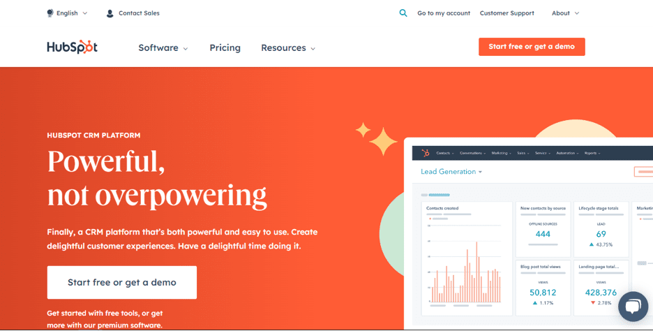
What we love:
- HubSpot uses a consistent color scheme throughout its subdomains
- No fancy colors. It uses two colors to keep things simple.
3. Best White Space: Google
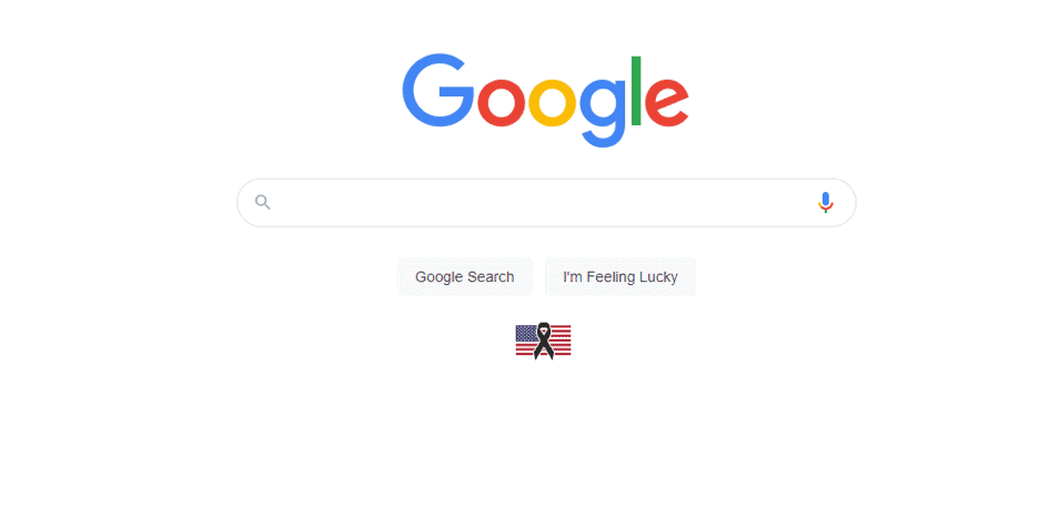
What we love:
- Google is best at using white space for its benefit
- You know what you have to do as soon as you visit Google
- White space is consistent across Google domains.
4. Best Typography: Apple
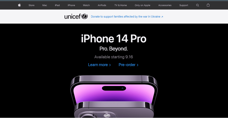
What we love:
- Basic typography with nothing fancy
- Proper visual hierarchy of the text based on its importance. You can’t take off your eyes iPhone 14 Pro even if you are not an iPhone fan
- Navigation text is minimized to divert attention to the key element (aka new iPhone).
5. Best Navigation Design: Shopify
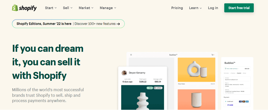
What we love:
- Clean primary navigation that doesn’t create any friction
- The menu is self-explanatory. You can tell by looking at the navigation what Shopify is about if it is your first visit
- For a site big like Shopify, it isn’t easy to keep navigation limited, but they did a great job.
6. Best Frictionless Web Design: ActiveCampaign
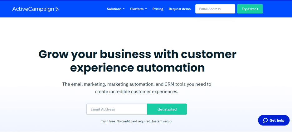
What we love:
- ActiveCampaign is an all-in-one marketing automation suite but how smartly it kept its focus on lead generation
- There is one option above the fold that is, get started by entering your email address
- It clearly tells visitors that signup is free and they won’t be charged.
7. Best CTA: Hulu
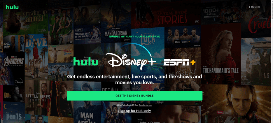
What we love:
- Descriptive call to action that tells the visitors what they should expect when they click it
- CTA color is prominent and at the same time consistent with the brand. That’s amazing
- An alternative CTA that lets users sign up for Hulu only. It indicates what they will miss if they sign up for Hulu.
8. Best Responsive Website Design: WIRED
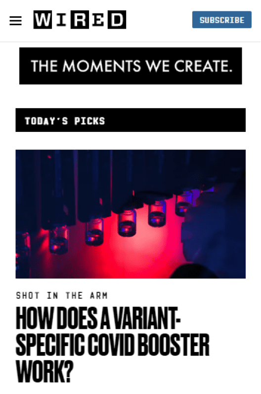
What we love:
- Perfect responsive design suitable for all types of devices
- Everything in the header disappears on the mobile version
- The site has exceptional UX with lots of white space to support readability on small devices.
Final Words
A well-designed website is crucial to the success of your business. Using the website design best practices covered in this article, you can improve your website’s design, convert more visitors, and increase profits.
By 2023, ecommerce purchases are expected to account for 22% of the global goods market. Consumers are attracted to well-designed websites. It’s up to you to hook and retain them with exceptional website design and relevant content that encourages them to take action.
While you don’t need to implement all these website design changes simultaneously, it’s best to pick one at a time, implement it, and test it. Website design changes need constant experimentation and A/B testing. It is a continuous process.
If you are not sure where to begin and how to take your website’s design to the next level, get in touch with us and see how our expert web designers can help you with your website redesign.